
Colour isn’t just about aesthetics; it’s a powerful tool that can influence user perception and behaviour. Understanding the psychology behind colours allows us to harness their potential to create engaging and impactful websites. Join us as we discuss the importance of colour psychology in design and explore how strategic colour choices can transform your website into a vibrant online space.
Why is colour psychology important in design?
When you understand the psychology behind colours, you’ll discover that it has the ability to influence the way users will view your brand. In web design, using a specific selection of colours well is really important. It subtly guides users towards desired actions on your website while enhancing its visual appeal.
How does colour psychology affect web design?
Subconsciously, users have a tendency of taking specific actions based on the colours that are linked to certain emotions. This is proof that by changing the colour on a call-to-action button, you are more likely to increase conversion rates.
By understanding how different colours can trigger emotions, you may want to make use of colour psychology to tailor the user experience.
Don’t have the experience or time to create a website that truly captivates your audience? Let us handle the design process for you! Visit our ecommerce store now and purchase one of our website design packages to get started on creating a vibrant website that drives results for your business.

How to balance colours in web design
Balancing colours in web design involves a thoughtful selection process. You may begin by choosing a primary colour that sets the tone for your website, followed by a complementary secondary colour and an accent colour to add visual interest. Strive for harmony by distributing these colours according to the 60/30/10 rule:
- 60% of the colour palette to the primary colour
- 30% to the secondary colour
- 10% to the accent colour
Ensuring that the primary colour dominates the palette while the secondary and accent colours provide supporting roles. Additionally, consider the psychological impact of each colour choice to spark the desired emotions and responses from your audience.
What impact does colour psychology have on user perception and behaviour in web design?
Colour in psychology plays an important role in web design as it influences how users perceive websites and behave on them.
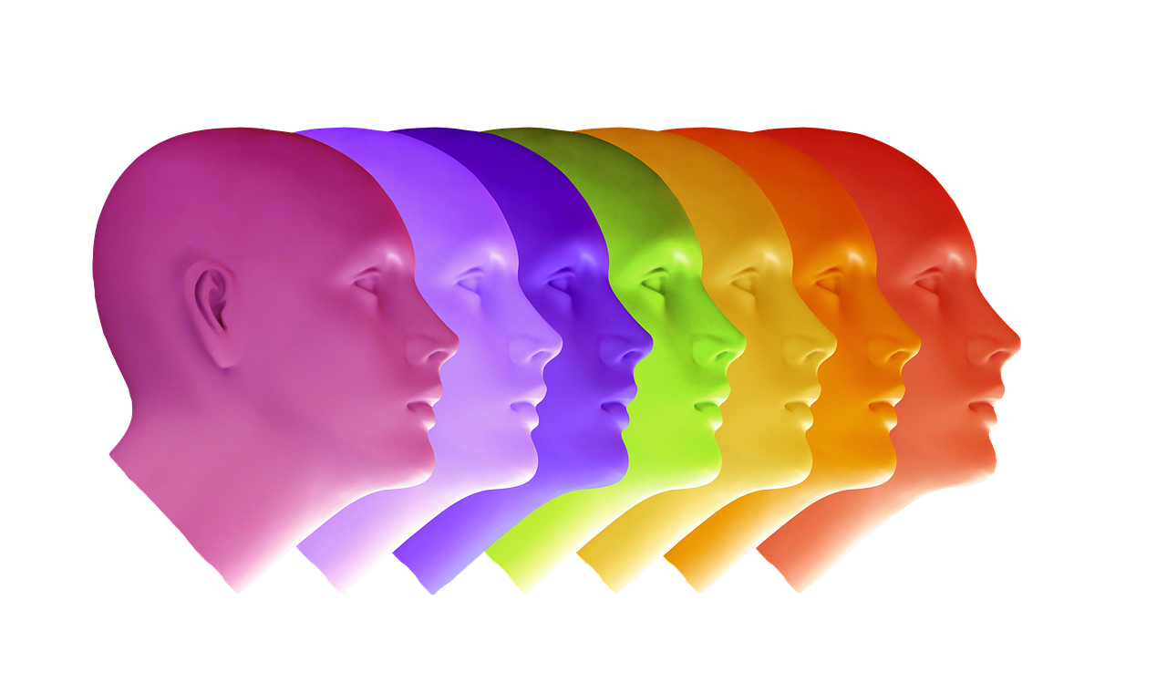
Here’s a simple breakdown of some key colours and what they can mean:
Red: Shows strength and passion, but too much might seem aggressive.
Orange: Gives energy and grabs attention, often linked with feeling positive.
Yellow: Makes things feel cheerful and noticeable, but can also signal caution.
Green: Is versatile, making people feel relaxed or energetic, depending on the shade.
Blue: Feels calming and trustworthy, great for showing professionalism or friendliness.
Purple: Represents loyalty, with a hint of mystery and luxury.
Pink: Is nurturing and playful, often associated with passion and youthfulness.
White: Represents simplicity and cleanliness, creating contrast and space in designs.
Brown: Feels earthy and secure, adding warmth and a natural touch.
Gray: Is a neutral shade that complements other colours or provides a calm background.
Black: Is powerful and plain, adding importance when used carefully.
In conclusion, colour serves as the foundation of effective web design, offering insights into how users perceive and interact with websites. By leveraging this understanding, you can craft visually appealing layouts that resonate with users on a deeper level. Whether it’s through the strategic use of colours to guide user actions or the careful selection of hues to trigger specific emotions, colour psychology plays a crucial role in shaping the user experience.
So, why wait? Elevate your online presence today! Browse our ecommerce store and purchase one of our expertly crafted website design packages to create a vibrant and engaging platform for your brand. Let’s start building your success story together.